Background
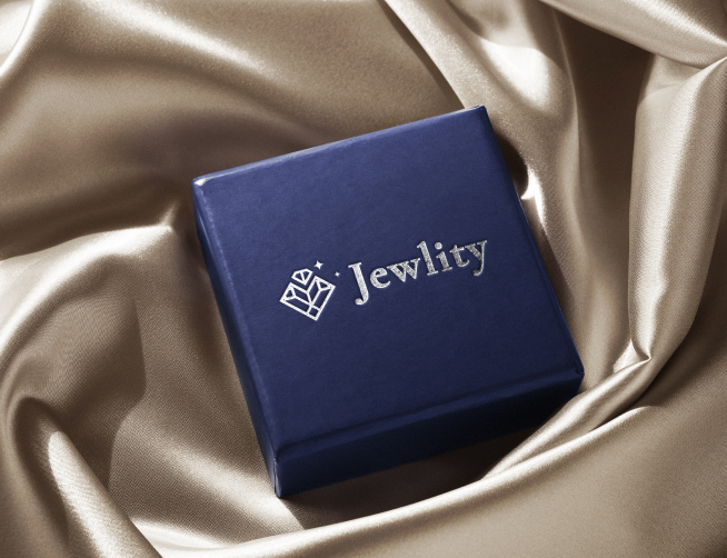
Jewlity is a jewelry brand where visual elegance is inseparable from the product. The identity has to feel as refined as the pieces it represents.
The Challenge
The brand needed an identity that conveyed craftsmanship, quality and a sense of premium desirability — distinctive enough to stand out in a visually competitive category.
Our Approach
Defining the brand feeling
We clarified the brand’s positioning and the emotions it should evoke — elegance, quality, and aspiration.
An elegant logo and system
We designed a refined logo paired with a sophisticated palette and typography that signal premium quality.
Consistency across touchpoints
Usage guidance ensures the brand feels cohesive from packaging to social to web.
The Results
- A refined, elegant logo that reflects the product.
- A premium visual system of color and type.
- A memorable, aspirational brand feel.
- Consistency across every touchpoint.
Why It Worked
In jewelry, presentation is part of the product. VentCube gave Jewlity an identity that looks as valuable as what it sells.