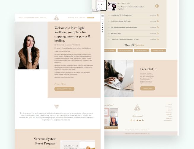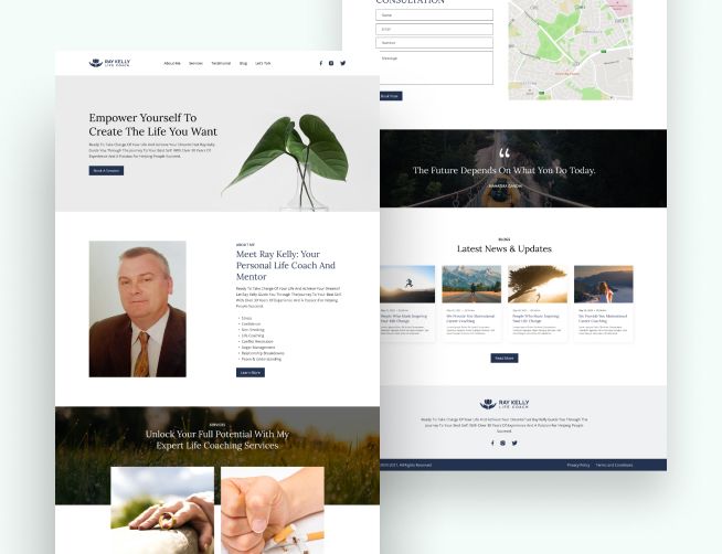
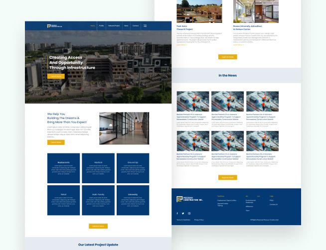
- Website design
Case study
We designed a logo and a full identity system for PageAppeal, with colors, type and simple usage rules, so the brand looks consistent on every channel it uses.
Project
PageAppeal needed a brand identity that made it easy to recognize and showed its personality wherever it appeared. Without a shared set of visuals, the brand risked looking different on every channel and being easy to forget. It needed a logo and a full visual system that could grow with it.
We started by defining PageAppeal’s personality and positioning with the client. That gave every design choice a reason, from the shape of the mark to the tone of the colors.
We designed the logo along with a complete system around it: a color palette, typography and supporting visual elements. Each part is designed to work with the others, so a social post, a web page and a document all look like the same brand.
We wrote clear usage guidance. It covers how to place the logo, which colors and fonts to use and what to avoid. Anyone making materials for PageAppeal can follow it without asking the designer each time.
People who meet PageAppeal on different channels see the same logo, colors and type each time. People who meet PageAppeal on different channels see the same logo, colors and type each time. The guidelines also save time, because new materials start from a set system instead of a blank page.
We design logos and identity systems alongside our UI and UX design work for small businesses, and we carry them through into website design. To talk through your brand and site, request a free audit.
This page describes what the client needed and what we built. We add numbers only when the client has approved them.
Free audit
We look at your site, your Google Business Profile and your ads, then send you a written report within 2 business days that says what to fix first.

Hi there. How can we help your business? Send us a message on WhatsApp.