Background
Guide To Pick is a recommendation-focused brand that helps people make better choices. Trust and clarity are central to its promise — and its identity needs to reflect that.
The Challenge
The brand needed a friendly, credible identity that felt helpful and unbiased, and that would be instantly recognizable across content and channels.
Our Approach
Positioning for trust
We shaped an identity built around clarity, helpfulness and credibility — the qualities that make people trust a recommendation.
Logo and visual system
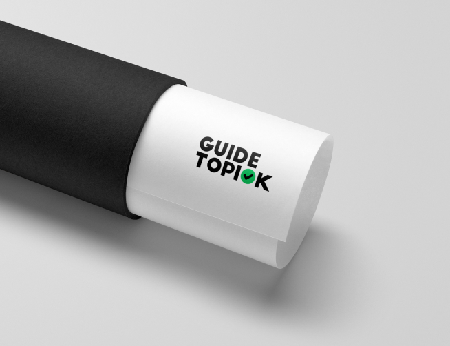
We designed an approachable, memorable logo with a clean palette and typography that read as clear and dependable.
Consistent application
Guidance keeps the brand cohesive across every piece of content.
The Results
- A friendly, trustworthy logo and mark.
- A clean, credible visual system.
- A recognizable brand across content.
- A consistent, scalable identity.
Why It Worked
Recommendation brands live or die on trust. VentCube gave Guide To Pick an identity that feels clear, helpful and credible at a glance.